


A little Tuesday-afternoon Memphis typography nerdery
Today I took to Madison avenue to get my daily picture, since I had passed by the Camp Electric Company's building a hundred times but had never had time to stop and capture their rather rusty and Spartan sign. Nestled just next door to Camp is Sam Phillips Recording, a legendary entity in music if ever there was one.
Here's the sign on the side of the building that faces Madison:
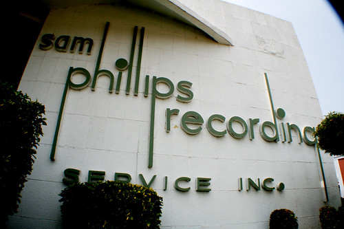
It's a nifty sign, and mostly pleasing to the eye. You'll recognize the typeface used here as Futura most likely.
I like the lack of capital letters in the first three words, and then the smallcaps in the last two. I dig the completely exaggerated ascenders and descenders (made to look more like music notes, no doubt, hence why the "g" in "recording" actually resembles a "q"). But there's one thing that kind of drives me up a wall about the type in this sign (besides the missing dot over the second "i", which I kind of suspect has fallen over the years: The "a" in "sam."
It's not a true Futura A. Futura's whole reason for existing is its perfect geometric shapes: perfect circles, perfect triangles, etc., which reflected a modern emphasis on bold form and pragmatic function. That a single A could disrupt the consistency of the (almost) perfectly round counters in the sign makes me twitch ... but just a little. That's not to say the sign isn't still a great sign — its quirks makes it endearing; the whole sign looks amateur and hand-cut, which it may very well be (I'm clueless about mid-century sign-making techniques). It's just interesting to wonder why the A got squished. It almost looks like an issue of horizontal space, but it looks like that could have been resolved other ways.
Also, on closer inspection, the S form looks a little wider than the true Futura S, which is actually a very slender letterform. So, anyone know the history of this sign?
UPDATE: Slate has some interesting type wonkery up today.
Here's the sign on the side of the building that faces Madison:
It's a nifty sign, and mostly pleasing to the eye. You'll recognize the typeface used here as Futura most likely.
I like the lack of capital letters in the first three words, and then the smallcaps in the last two. I dig the completely exaggerated ascenders and descenders (made to look more like music notes, no doubt, hence why the "g" in "recording" actually resembles a "q"). But there's one thing that kind of drives me up a wall about the type in this sign (besides the missing dot over the second "i", which I kind of suspect has fallen over the years: The "a" in "sam."
It's not a true Futura A. Futura's whole reason for existing is its perfect geometric shapes: perfect circles, perfect triangles, etc., which reflected a modern emphasis on bold form and pragmatic function. That a single A could disrupt the consistency of the (almost) perfectly round counters in the sign makes me twitch ... but just a little. That's not to say the sign isn't still a great sign — its quirks makes it endearing; the whole sign looks amateur and hand-cut, which it may very well be (I'm clueless about mid-century sign-making techniques). It's just interesting to wonder why the A got squished. It almost looks like an issue of horizontal space, but it looks like that could have been resolved other ways.
Also, on closer inspection, the S form looks a little wider than the true Futura S, which is actually a very slender letterform. So, anyone know the history of this sign?
UPDATE: Slate has some interesting type wonkery up today.
Labels: design, Memphis, typography
posted by theogeo | 5/29/2007 12:44:00 PM
![]()
3 Comments:
This blog post reminds me why I enjoy knowing you as a person.
So I spent way too much time examining fonts and font slideshows online this morning. And Halle-Fricking-Lujah if I didn't find a cult of like minded comic sans haters here
My day started off fine until I found that site and my hatred for that ridiculously juvenile, eye sore of a font bubbled up. And now I am angry. Funny, and I imagine the designer of that flub in typeface assumed it would bring so much joy.
Oh, and as far as your original question goes, I know nothing of that sign. I just thank jesus Sam Phillips didn't like comic sans.
Fritz, aw, thanks. :)
La, I too am part of that cult. Microsoft has unleashed several unacceptably ugly typefaces on the world (think also of Arial as a Helvetica knockoff).
The sad thing is that Comic Sans DOES bring lots of joy. To the dirty plebians of the world, but joy nonetheless.
Post a Comment
<< Home