


The importance of proper letter spacing, vol. 2
It's not as bad as this, but it makes me wonder if there is an epidemic of church signs with questionable letter spacing. Which, yeah, obviously, I'm sure there is.
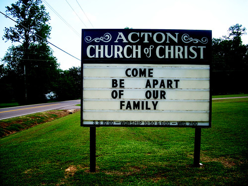
I'm trying to figure out if there's some play on words I'm not getting, or why the words would be arranged this way, and I've got nothing. All I know is that telling people they can come be apart of the church family isn't a terribly welcoming way to recruit new members.
I'm trying to figure out if there's some play on words I'm not getting, or why the words would be arranged this way, and I've got nothing. All I know is that telling people they can come be apart of the church family isn't a terribly welcoming way to recruit new members.
Labels: church signs, typography
posted by theogeo | 6/11/2008 01:32:00 AM
![]()
1 Comments:
For the same reason that people write "alot."
Post a Comment
<< Home